MARKET SAVVY
The Denver Central Market in RiNo is full of mouthwatering design details to match its elevated food scene.
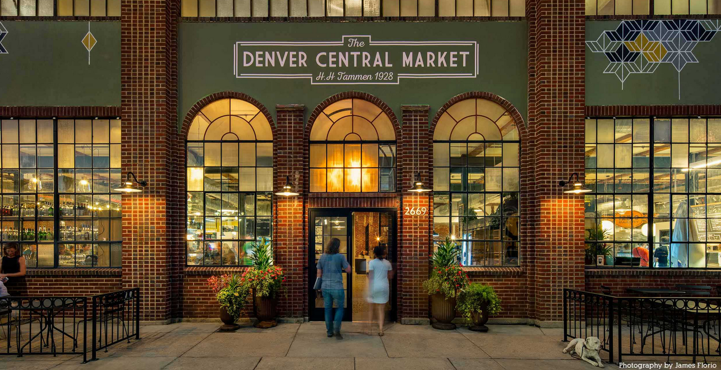
IN 1928, RETAILER H.H. TAMMEN & CO.’s SPRAWLING NEW BUILDING ON LARIMER STREET housed mementos you might find in a Rocky Mountain gift shop—postcards, souvenir spoons, and quirky little clocks embedded in Colorado gemstones. More recently, the brick-clad space at 2669 Larimer Street was the headquarters of Motorsports Gallery, which sold and repaired classic cars. Walk in today, though, and you’ll find that the four-wheeled tributes to German and Italian engineering have been replaced by the aromas and sounds of 11 purveyors dishing up coffee, chocolate, meat, produce, baked goods, and more. The Denver Central Market, which opened its doors in September, is the kind of place where you might quickly cross a few things off your shopping list or linger over a beer, all while admiring chic, modern design elements thoughtfully arranged on an industrial stage.
“I want people to think of this as a gourmet market—not just a place to eat,” says the project’s developer, Ken Wolf, a longtime contributor to RiNo’s revitalization. “When you walk in, the first thing you see is the fish counter and the butcher, and that reinforces the idea that this is more than your standard food hall.” That point is driven home with exposed brick walls, a diverse collection of colorful and comfortable chairs, and custom pendant lighting that casts a warm glow on the vendors who greet you at every countertop.
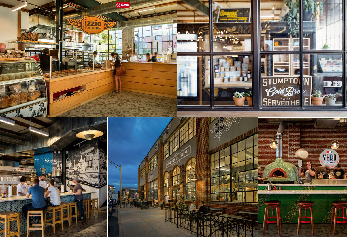
Ask architect Brandon Anderson to share his inspiration for the space, and he uses adjectives like “open,” “appropriate,” and “cohesive”—more mellow descriptors than you might expect from a principal at LIV Studio, which created eye-popping sites such as Sushi-Rama and Glazed & Confused. But a shock-and-awe strategy was never the intent. “Our goal was to make everything fit with the building,” he says, a task made easier by the fact that most of the vendors followed Wolf’s lead by choosing LIV as their designer. “A few vendors have their own shops nearby, and we didn’t want to lose their individual flavors, so we held the reins lightly,” Anderson says. “We wouldn’t want everyone to put a unicorn on the back of a storage compartment from a Coke truck, like Crema Bodega did—but we loved that little bit of funkiness, and it was great to have a few vendors do something unusual.”
The space’s cohesiveness is immediately evident as you move from the entrance’s arched brick facade into an identically curved glass-topped vestibule. A few steps away, Temper Chocolate’s French truffle case features a rounded glass countertop that elegantly slides back so you can get a close look at your favorite confections. Throughout the space, Daltile ceramic tiles—from the porcelain floors with romantic patterns etched in shades of gray to Italian shop Vero’s beautiful green-and-red pizza oven to the ocean blue tiles that frame Silva’s case of fresh fish—reinforce the classic feel and provide the durability needed in a working market.
Nods to history are everywhere: Crema’s countertop was fashioned from a wooden beam that was removed from the building’s basement to make way for a staircase. A life-size black-and-white photo of Denver’s 1920s-era fish market serves as a backdrop at Silva’s. Chalkboards and old-school letter boards advertise daily specials. Common areas are illuminated by huge overhead lights salvaged from a Detroit gymnasium. Incandescent bulbs that mimic early 20th-century signage spell out the names of vendors Curio and chef Sean Kelly’s SK Provisions. Taken together, the design details give the brand-new emporium a timeless quality that just might convince visitors the Denver Central Market has been there forever.


