SIDE BY SIDE
They live together, play together, and work together. For this graphic design duo, leaving a mark on some of the region’s cultural institution requires modern typography, inviting illustrations and loads of quality time.
Modern in Denver
JARED AND RACHEL RIPPY CAME AT DESIGN FROM OPPOSITE ENDS OF THE SPECTRUM. As a child, he discovered illustration and iconography through a love of Major League Baseball logos, while she learned about oil painting from her grandmother. Two decades later, he focuses primarily on typography and illustration while she enjoys strategic thinking and pixel-perfect web design. That combination of talents has helped them create sophisticated identities for businesses and government agencies with an architectural bent — abilities they’re now extending to their work for nonprofits and cultural institutions.
The two met at the Art Institute of Colorado in 1999, married a few years later, and polished their skills during five years together at the Aspen Art Museum, where Jared was hired as design director and later “put in a good word” for his wife. They spent their days creating brochures, invitations, mailers, and websites, and even designing exhibit spaces. Fundraising materials also took up a healthy portion of their efforts—part of an $80-million capital campaign that helped fund construction of a new building while also carving out a bold new brand for a small-town museum. Three years ago, the couple launched their small agency — Novel — from a home in Bailey, Colorado. For the last year they have been working in a duplex on a quiet tree-lined street on Capitol Hill, where they share a home with two Boston Terriers, Eames and Pal.
Being married to your design partner certainly has its benefits — creating a level of trust that makes feedback much easier — but it can have its drawbacks, too. “It’s tough selling ideas to your spouse, because she knows all my tricks,” Jared said, “but in the end, she helps offset my weaknesses, and I help offset hers.”
Jared counts among his influences Pablo Picasso, L.A. illustrator Geoff Mcfetridge, and French artist Malika Favre, all known for a clever combination of line and color that evokes warmth and familiarity. That level of sophistication paired with simple, often child-like line drawings is indeed novel, and a more-than-likely explanation for the agency’s name.
“We definitely want to communicate a level of sophistication for our clients,” said Jared, “but we don’t want the work to feel too stuffy or high-brow — we want it to come across as human, so we like to add some softness, to make a connection between the client and the customer.”
And Denver’s evolution has helped make Novel’s design feel more welcome. “The changes in the city’s cultural scene over the last 10 years have been crazy to watch,” says Jared. “Denver is starting to catch up with some of the bigger metropolitan areas like Portland, Seattle, and even San Francisco. People are open to bigger ideas, bigger risks, and not being so literal—and it all makes our work seem more applicable.”
Case in point: CO-LO Ltd., a Denver real estate broker, wanted to signal their firm’s attention to detail and concierge-level services, so Novel created a custom typeface and paired it with graphic illustrations that put Colorado front and center without relying on photography, like most of its competitors. BendonAdams, an architectural consulting firm in Aspen, wanted to separate itself from others with a mark that evoked strength, professionalism, and a feeling of community. The resulting monogram alludes to the collaborative, integrative approach of the principals.
Rachel points with pride to Novel’s work for Mukha, “a blog started by the founders hoping to interview one person from every country — an esoteric site that takes a vagabond perspective to the idea of international lifestyles and creative pursuits,” in her words. She also sites digital platforms for AspenModern and AspenVictorian, which document the city’s buildings for architecture buffs and visitors planning their own walking tour; Novel designed simple modular grids with the flexibility to allow the sites to grow, and typographic elements that match the respective architectural styles.
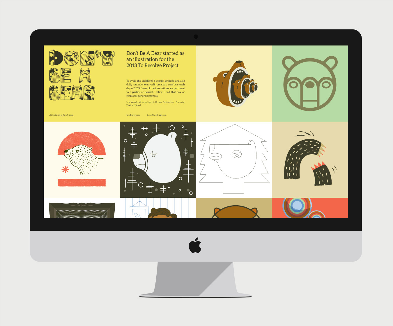
Jared and Rachel enjoy getting away from the computer and initiating their own passion projects, too. In 2013, he drew a bear every day, and posted them all online, to fulfill a New Year’s resolution. In 2012, the couple launched Postscript — a series of postcards that take their inspiration from the history of Denver’s city streets, from Wazee to Wadsworth; printed by letterpress shop Banshee Press, they’re available for sale online and in local stores like I Heart Denver and the Watercourse gift shop. The side projects have even found their way into their day jobs: Clients often request an original postcard as part of any identity package, and oddly enough, a few clients have even asked that a bear be incorporated into their logo; so far, not a single grizzly has made its way to a client’s business cards.
The Rippys have one long-term dream project: Translating their love of food into their work by partnering with a restaurateur to create branding for a few vegetarian restaurants. “Food is such an important part of our lives” said Rachel. “I’ve seen family members fight cancer and heart disease, and a lot of people seem to find nutrition very confusing, so we want to help get people moving in the right direction.”
For now, the agency is focused on design and illustrations for posters commemorating the 50th anniversary of the Summer of Love in San Francisco; an app called Turtle, which aggregates critical information for college students (launching soon at Berkeley); and the identity for a skate, longboard, and snowboard company in Pennsylvania. With so many projects blurring so many boundaries, it’s nice to have a reliable partner under the same roof — even when they know all your tricks.


