TAVIS COBURN: WHAT’S OLD IS NEW AGAIN
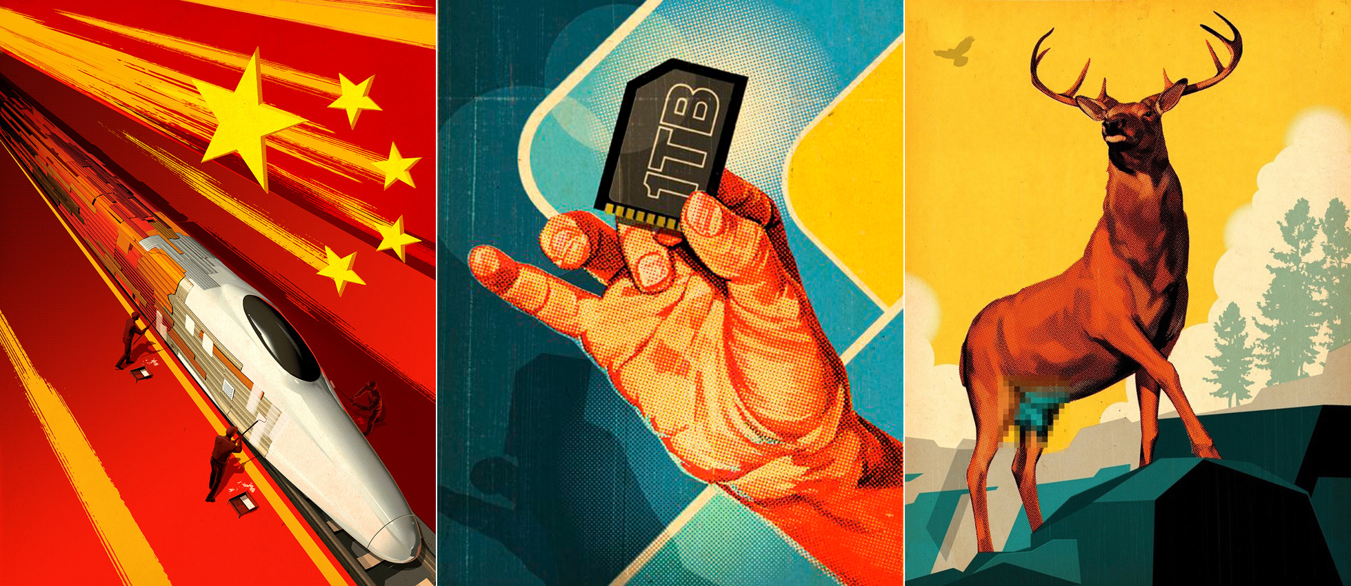
LIKE SOME SORT OF TIME-TRAVELER IN A SCI-FI NOVEL, Tavis Coburn is stuck between two worlds, creating nostalgic images that appear to be rendered with ink and silkscreens as well as modern 3-D renderings that appear to be plucked from a video game. A golfer from “Fun With Dick and Jane” sports a pricy new watch and a titanium driver. A hand rendered in half-tones grasps a 1-terabyte computer chip. And a fictional astronaut with a striking resemblance to Matt Damon graces the cover of Popular Mechanics.
Coburn re-creates that classic style for clients like Heineken, Lexus, Virgin and Volvo, who all want a modern aesthetic that conveys the fact that they’ve been around forever. Ironically, magazines like Esquire, Field & Stream, and GQ, whose early cover art inspired Coburn’s style, now turn to him to recreate that emotional connection with a new generation of readers.
“Throughout the ’40s, ’50s and ’60s, that visual solution that many illustrators adapted was not only able to clearly portray American life, but it also sold American products very efficiently,” says Coburn. “My work uses a similar approach, but I like to interject modern themes and new ideas—take an old vista and add a new car or an iPhone or an ethernet cable—something that you might see in science fiction.” Art directors at Foreign Policy asked Coburn to render a futuristic Chinese bullet train in the style of a propaganda poster and a Popular Science had him illustrate a buck with its family jewels digitally concealed for a piece on deer contraception.
“Sometimes I think I was born in the wrong century,” says Coburn. “Old magazines like Popular Science and Popular Mechanics had a huge influence on me, but that illustration style always came easy to me—I never spent hours and hours trying to figure out how those old-school illustrators painted things; it just came out that way, naturally.”
Coburn’s interest in illustration started when he discovered Georges Remi’s “The Adventures of Tintin” at an early age
“I’ve loved comic books since I was young,” he says. “I moved around a lot as a kid and ended up spending a lot of time by myself. I remember picking up a copy of Tintin at the Halifax Library and just falling in love with the pictures, the composition—each issue was just such a wild ride, with tanks and rockets and machine guns and so many crazy things happening. Coburn seriously considered becoming a comic book artist, until an architectural illustrator came and spoke to his arts highschool in a suburb of Toronto, shedding a light on the many other professionals that involved an artistic touch
“As a student at Art Center of College of Design in Pasadena, I remember going through the collection of old illustration source books and being blown away, thinking ‘This is exactly what I want to do.’ Movie posters, book covers, CD covers—the variety seemed like so much more fun than illustrating comic books.” Coburn quickly found himself drawn to the European avant garde—a style popularized by Eastern propaganda posters. An active BMXer and skateboarder, he was also reading Thrasher magazine and surfing publications with David Carson’s innovative typography and unexpected page composition that he’d never seen before.
A RECORD START
During Art Center’s senior portfolio review, an art director from A&M Records was so enamored of Coburn’s work, he asked him to create cover art for a CD sampler, due the very next week.
“I finished the project thinking, ‘This is the worst thing I’ve ever done, I’ll never work again,’ stuffed it in an envelope and gave it to a messenger,” he says. “Forty minutes later they called me and said, ‘We love it. Want to do some more work for us?’”
It was 1998. Record companies were still flush with cash, and in need of designers and illustrators to produce a steady flow of work. LA’s record executives formed a small, tight-knit community; budding art directors were always looking to get that next promotion, and would move from A&M to Capitol or Warner, and bring all of their freelance connections with them. And they kept Coburn busy crafting illustrations for CD samplers, posters, and packaging. All along, he had his eye on New York publications like Rolling Stone, considered the holy grail for illustrators. But his first big editorial project came from his backyard: Art directors at Entertainment Weekly had seen his work and asked him to produce a two-page spread for an article with a science-fiction angle. At this point, he was actually screenprinting all of his work, coating screens with light-sensitive medium and stuffing them into garbage cans, then removing them to burn images, pull ink with a squeegee, and photograph the final result.
“It was madness,” he says. “The whole process involved so much physical work. But I was young at the time and had lots of energy—and compared to working on the computer, there’s something really satisfying about putting in a full day’s work on your feet.”
When he left LA to return to Toronto in 2004, Coburn sold all of his screenprinting equipment and started reverse-engineering the process digitally. Today, he relies primarily on Photoshop’s Camera Raw, Warp and Liquify for simple spot illustrations, and opens up the digital sculpting programs ZBrush and Maya for detailed three-dimensional pieces. While modeling complex 3D shapes for a person or a vehicle, he can determine how light bounces off of hard edges, just like a cinematographer piecing together a movie scene. Before locking down a final file, he’ll return to Sketchbook Pro and Photoshop to use filters, add patterns, and flatten out the image. Scans of old vintage paper with nicks and cracks are often used to inject an analog feel into the digital process.
WALL TO WALL ILLUSTRATIONS
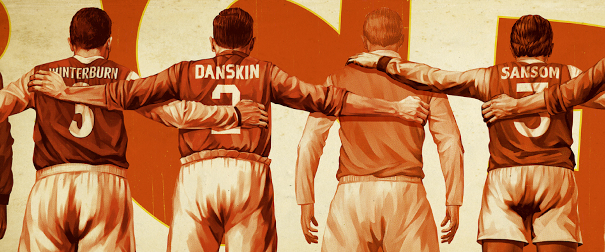
Today, with the help of his agency, Dutch Uncle, Coburn stays busy with editorial work for Fast Company, Foreign Policy, Wired, and, yes, Rolling Stone. But of his many high-profile projects, the biggest—literally—is his work for London soccer club Arsenal.
“Arsenal had played at Highbury since 1913, and fans hated the idea that the old stadium would be knocked down to build condos when the team moved to a new stadium,” says Coburn. “So they hired design firm 20.20 to wrap the new stadium’s cement towers with images of great Arsenal players of the past.” And 20.20 came to Coburn, who spent eight months on the project, manipulating massive Photoshop files that maxed out his computer’s memory. In the end, client and agency were thrilled with the results, which added a warmth and nostalgia that most modern stadiums lack. In that part of London, the city streets are so narrow, and the hulking stadium is so centrally located, that residents can see the images from nearly everywhere.
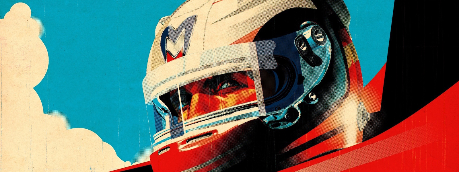
As it happened, the marketing director for Virgin’s F1 racing team was a huge Arsenal fan, and as soon as he saw the work, he tracked down Coburn for another sports-themed branding project that seems to be plastered all over Behance and Pinterest.
“Virgin wanted to be the anti-F1 team, almost like the ‘punk rock’ kid on the block, that’s the way Richard Branson rolls, so it was great to work with their ad agency, Poke London,” says Coburn. If you had asked me when I got out of school, if I’d ever imagine myself doing work in motorsports, I would’ve said ‘no.’ But in the past few years I’ve been so close to the track that a true racing fan would be horribly jealous—some really great opportunities that most illustrators will never experience.”


